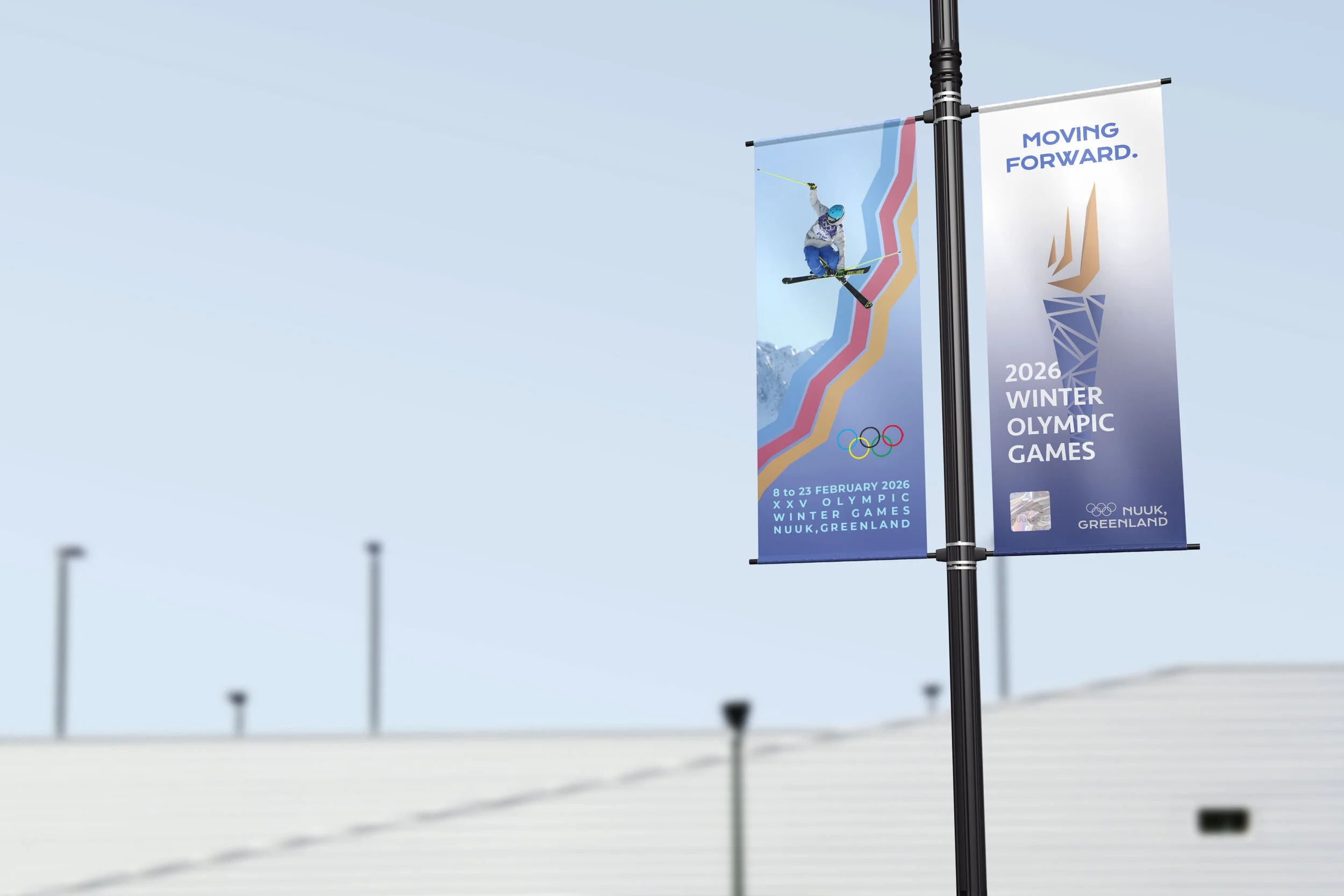
olympics rebranding
For a school project, we took the Olympics and rebranding it; picking a city and “creating” the Olympics for that city- from the logo, to the medals, to the website & app, to the banners and posters.
the logo
This logo was designed with the intention of combining many aspects of Nuuk and the Olympics together, while portraying the uniqueness of Nuuk.
The zig zag lines represent the peaks of mountains, the rows of colorful houses, the flowing northern lights, and the architecture of the Katuaq Culture Centre - a landmark in Nuuk. These zig zags also symbolize racing tracks for skiing, luge, bobsled, and more Olympic events.
The colors chosen are those of Greenland’s national dress, and are also the colors of the houses, found scattered throughout Nuuk’s vast landscape.


